For our first assignment, we had to design our name and incorporate elements of what we love and hate in our designs...
It took me really long to think of what I exactly love...then I decided upon royalty...because I really love all motiffs to do with royalty...
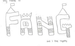
Here are my very first drawings on My Name is Fang...I LOVE ROYALTY.
A Castle Motiff
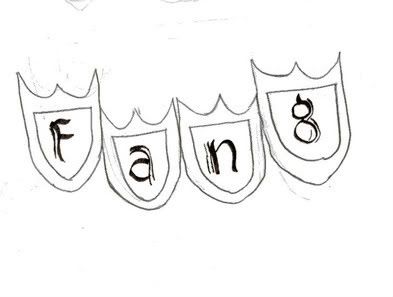
Shield Motiff
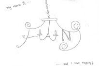
Castle Lighting Motiff
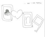
Poker Cards Motiff
During the 1st tutorial as I presented to the class my drawings for the 'I Love Category', Tutor Jing pursed her lips and then said "This is difficult..."
I think what she meant was that 'I love royalty' was simply too vague a category for me to draw... I should zoom into a specific thing like I love castles, poker cards etc. instead of such a general category.
Moreover, my drawings did not express my love for 'royalty' at all... As a designer, I did not achieve my communication objectives and I should be more straight-forward in my drawings.
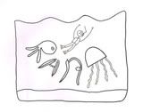
Then it came to the 'I hate' category, I chose to do 'I hate fishes'.
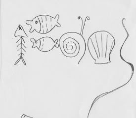
Here are the my initial drawings:
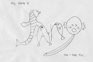
Jing and the class suggested that in order for me to communicate the 'I really hate fish' msg, I should include the element of fear inside or make the fish more overwhelming so in my next step, I chose this picture of myself swimming away from the fishes(that forms my name: Fang). I think this is more effective because the body language suggests that I am really frightened by the fishes (swimming for my life...) and yea...the irony of it...i love the sea, really want to try diving but marine fishes really frighten my life out of me...
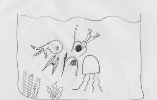
And Ta-Da! This is the piece I am going to present for Tutorial 2!
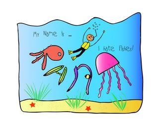
Somehow on first look, the colourfulness of the design gives the impression that this is a positive design... I don't want to make the ocean and fishes too ugly by choosing dull colours because I personally find the ocean and fishes beautiful and I have always wanted to go diving but somehow the thought of coming in close contact with the fishes gives me the creeps and makes me want to turn back...
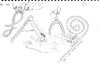
As for the 'I love' category, I did not stick to the original idea because it was pretty vague. Hence, I turned to the idea of roller-coasters and slides.(Why didn't I come up with this earlier?? Sighx :(
Here are some of my initial rough designs for 'My name is Fang. I love roller coasters'
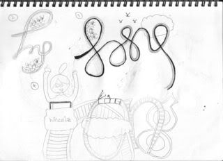
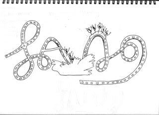
I did consider the design with the cursive font roller-coaster and further developed it into this:
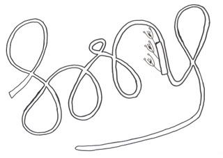
I thought of using Photoshop to create a Universe/Galaxy/Milky Way Background and then layer this picture on top to create a 'The Freedom of Riding on a roller-coaster in outer-space' feel but then i realised it is logically wrong because there is NO GRAVITY on outer space!! So i did not develop this idea.
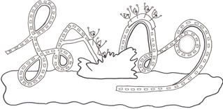
I chose the below one instead:
I personally like this design alot because it definitely has the element of fun but yea...its quite badly drawn~haha.
2nd attempt
Yesh, I chose not to draw faces so that the attention can be on everyone on the roller-coaster. This makes the design look more proportionate.
I also made the letters F A N G less disjointed by joining the roller coasters together, thus creating some sort of a flow. Instead of a separate slide, I created a roller-coaster that goes onto land and water! By making the design less angular but more curvy, I believe this makes the drawing more fun and better illustrates how fun roller-coasters are!
And I tried scanning this 'dirty' drawing and removing the eraser marks in photoshop..Unfortunately, because this was drawn quite hastily as a draft, the lines could could not connect well and I had a lot of trouble trying to paint the picture. The gaps couldn't close in well and the colour overflowed, so i redrew...
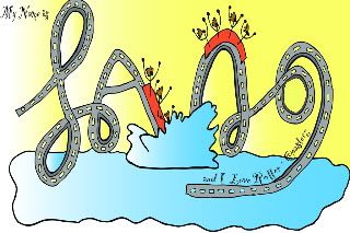
Final attempt
This time, I enlarged the water border to give a more wholesome feel to the picture...I want to avoid detaching the letters together. So now the roller coaster looks more like it is just above the water surface. How exciting! I like how it goes into the water and the splashing effect!
It was crazy doing this...I rasterised this image out of curiosity and realised that I had accidentally saved it over my original picture!!! So when I converted to jpg it was quite blur when i printed it...sighx....luckily i have a pdf copy of the original that was created. I am going to use the pdf file to print the design out in school. It looks much clearer than the jpeg file on screen and printed out in black and white...I hope nth goes wrong when i print it out in school tomorrow... I really don't want my efforts to go down the drain when the image turns out blur....!!!!


